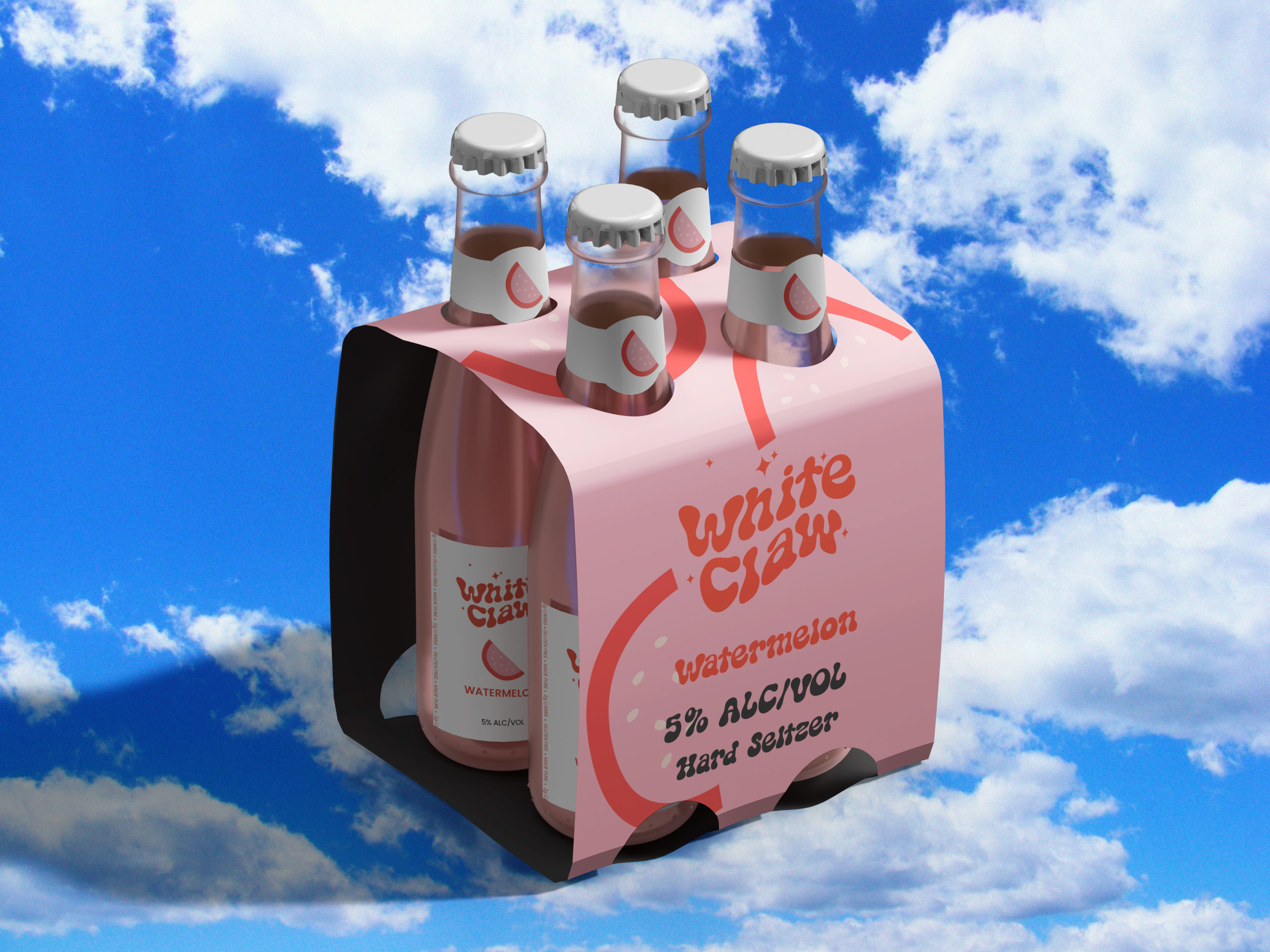
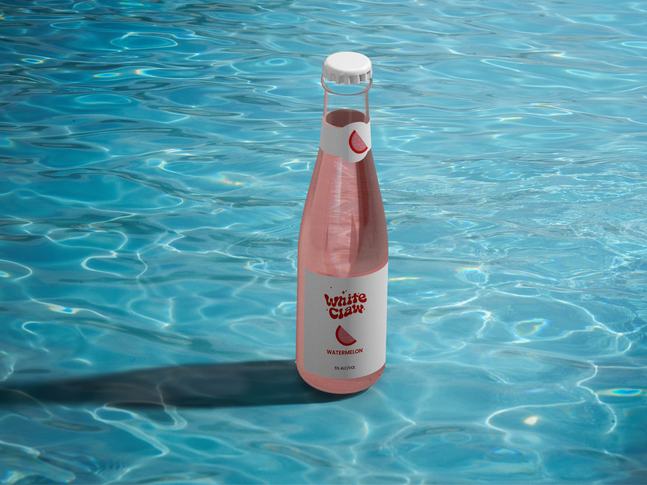
CONCEPT: White Claw Re-Brand
Task: My task was to re-brand White Claw into a sexy, bold, and colorful hard seltzer brand from the 1970’s in the United States.
The target audience for this brand enjoys listening to ABBA, The Beatles, and the Bee Gees. They are aware of what they put into their bodies, but it doesn’t stop them from having a good time. Saturdays are for the couch pit with your friends. I know that this character I created will help me step into the environment of the target audience.
For copywriting, social media, and email marketing services, contact here.
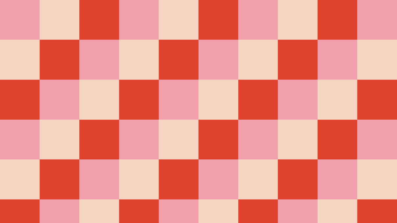
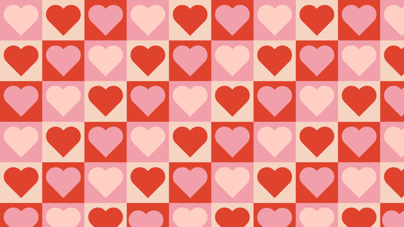
Crafting the mood board involved selecting groovy wordmark logos echoing the 70s vibe. Balancing nostalgia with modernity, I refined designs for contemporary appeal. Additionally, visuals of bedrooms, living rooms, and backyards from the era enriched inspiration.
- Curated groovy wordmark logos reflecting the 70s aesthetic.
- Balanced nostalgia with modern design elements.
- Integrated visuals of target audience’s spaces:
- Bedrooms
- Living rooms
- Backyards
- Drew inspiration from authentic 70s homes.

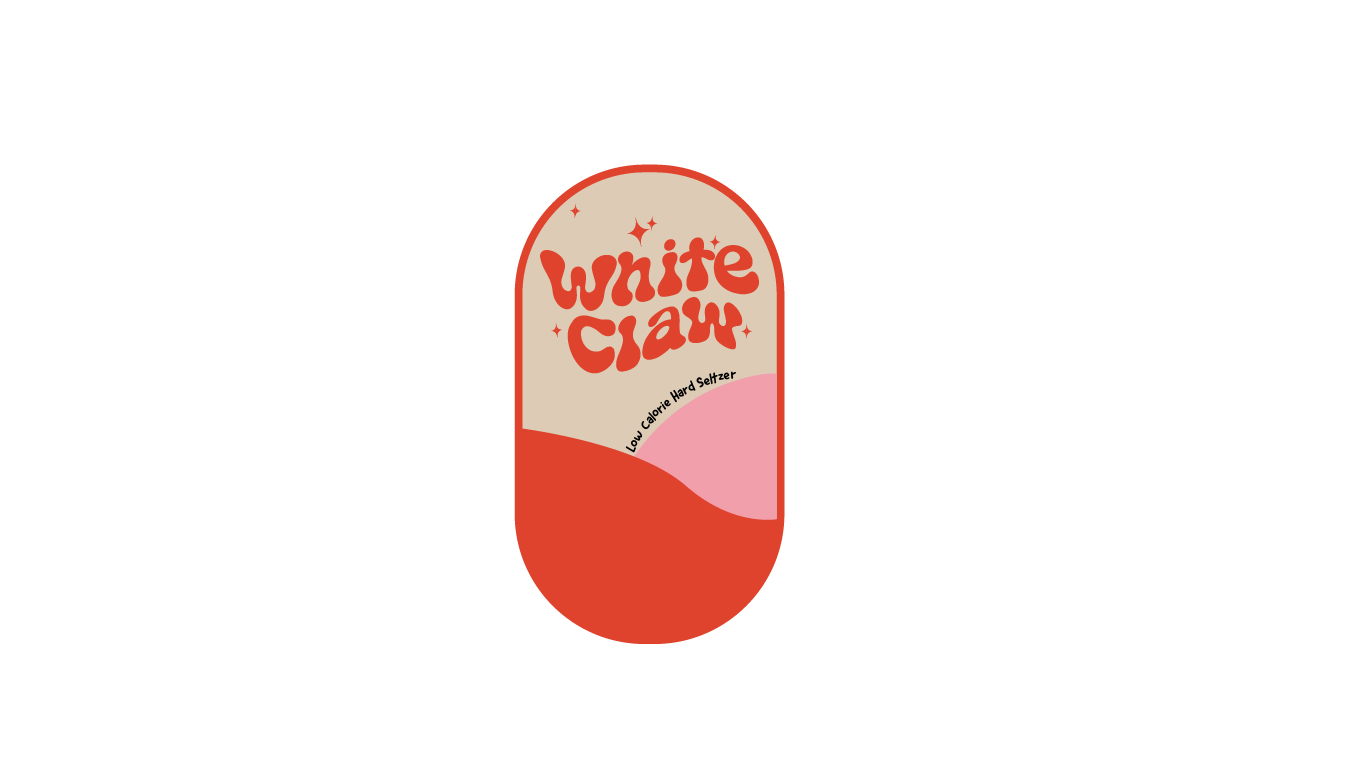
Beginning the project, I explored various typefaces, venturing into customizing typography using the pencil tool for the first time, aiming to align with 1970s logo styles. Opting for black as the base color, ensuring versatility and scalability without compromising quality.
- Experimented with diverse typefaces, delving into customization.
- Utilized the pencil tool for the first time to tailor typography to 1970s aesthetics.
- Chose black as the primary color for its versatility and scalability.
- Ensured the design maintains quality regardless of color or size adjustments.
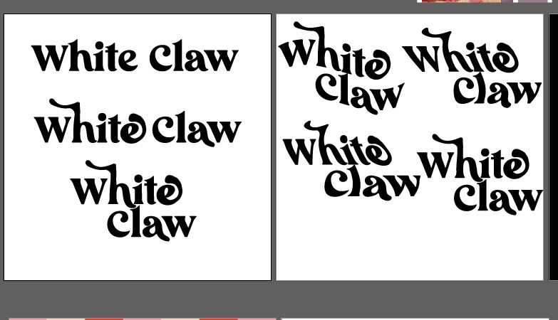
I went through multiple typeface choices to decide what direction I will be taking.
All of these typefaces all fell in the same category, groove. During my research, groovy fonts is something I noticed was very prominent with the 1970’s.
I narrowed down my favorite ones and soon after that I began to style them.

This is where I began to style some of my favorite typefaces. I tried multiple styles of distortion for typography.
Twisting the typography, warp, arch, and a zig zag effect. Ultimately I felt the “flag” warp worked perfectly for a wordmark logo inspired by the 1970’s.
I also experimented how I would tie the “Hard Seltzer” title in the wordmark logo. I felt that the type should play off the main type “White Claw” so I sketched a wavy line that curves around the main type.

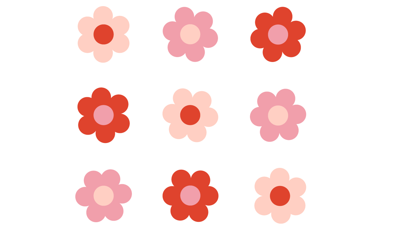
Once I got the typography sorted out, I added the colors I thought were appropriate to the target audience.
Once the colors were added I decided to put this into a circle or square, ultimately I decided that a rounded rectangle would work.
This is where the project started to come to a close.
To reflect on the project, this project was a lot of fun because I was able to teleport back in time to see and create patterns that were synonymous with the 1970’s in the United States.
If you have an upcoming project and need branding services please contact me.